For more context read Chapter 1 first.
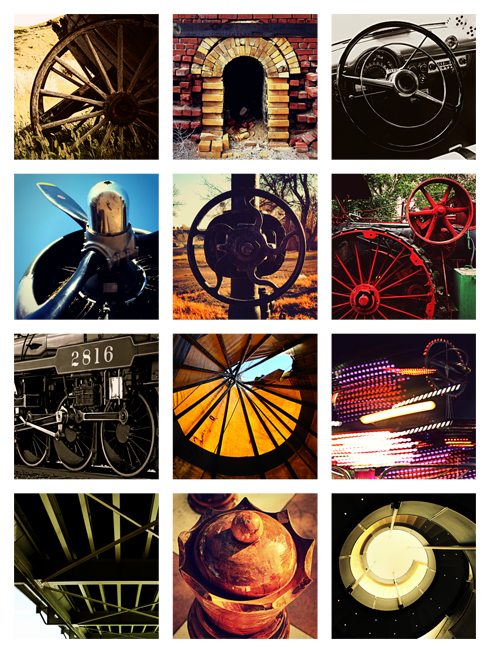
Right before Christmas the panels for my art installation were delivered. The 12 acrylic panels, which could be on display at the airport as early as this spring, are the result of the City of Medicine Hat commissioning me to create a permanent art wall utilizing the images from my Medicine Hat photo series, Around the Hat.


In Chapter 1 I discussed the proposal and basic idea of the project, "... my installation is big on textures, and the variety of images play well off of one another with shapes creating a common theme among them. For the panels themselves, I proposed a set of twelve 28x28" panels printed on 1/4" optically pure acrylic. These panels are then mounted using stand-off hardware".
The goal of my installation is to highlight Medicine Hat in a way that feels unique to the location in reference to both the community and the airport itself. To enhance my concept, I decided to create a theme based on circles and spokes.
I wanted strong lines and shapes to be the unifying factor behind my otherwise very diverse collage of local imagery. I focused on using medium shots and close ups because I felt the scale of the panels would make the images even more dramatic. I incorporated a lot of transportation references, highlighted a variety of colours and raw textures, and played around for hours to find the right balance for how my images were organized into a collage. Finally, this was the result:
 This is how the installation will appear on the airport wall, approximately 3.5 meters high. I think the shapes and colours are dynamic and the scale of the installation makes it look quite bold. The panels also play well off of one another and touch on a number of local trademarks without being blatant. It's familiar, but still gives you room to fill in the blanks.
To explain my work in further detail, below I've outlined a bit about each panel.
1. Wagon Wheel
This image of an abandoned wagon was shot at Echo Dale Farm. It's a nostalgic throwback, references a mode of transport, and clearly fits my circle and spoke theme. Also, with so many strong textures making up the installation, I really wanted to include this beautiful weathered wood.
2. Brick Kiln
This is the arch of the last remaining brick kiln located at the former site of the Alberta Clay Products factory. I wanted to include a reference to Medicine Hat's historic clay district, and the half circle and strong lines created by the crumbling bricks worked well with my other images.

3. Steering Wheel
This is the vintage interior of a 1950s Ford that I photographed at the Pioneer Village during Stampede. It's another reference to a mode of transport and a throwback that fit my theme.

4. Plane Propeller
This is the propeller of a B-17 Flying Fortress that I photographed at the Medicine Hat airport in the summer of 2012. The circle and spokes are once again clear in this panel, however it's also a personal cameo - you can clearly see my reflection in the prop.

5. Well Wheel
This is an old natural gas well wheel, which once again felt like a more subtle way of incorporating the city's heritage into the installation. I also love the curvy spokes.
6. Vintage Tractor
This image was an easy choice because the bright red wheels and gears were not only a perfect match for my theme, but the tractor was a nice reference to the agricultural roots of the community.

7. Train
This is an image of the famous Canadian Empress steam train that I shot in the Medicine Hat rail yard during a tour it was doing across the prairies. Medicine Hat has always been closely linked to the railway and it felt important to include that. Transportation, history, circles and spokes - this image has it all.

8. Teepee
I made a point of saying that I didn't want to be too obvious, so instead of a typical shot of the Saamis Teepee (arguably the city's most recognizable landmark) I opted for a real teepee. I loved the golden yellow of this shot, and the supports echoed the lines of the spokes in my other panels. This was also a nice way to reference our aboriginal history, and the roots of where our city got its name.
9. Midway
Blurred lines, bright colours, and motion. I shot this image at the Stampede Midway, and liked the variation that this shot brought to my circles and spokes theme. I also thought that in addition to the transport images, a shot that conveys motion was a nice fit for an airport.

10. Finlay Bridge
This is an image of the underside of Finlay Bridge, and was my way of referencing the city's river. Once again I chose an image with strong lines, and you'll notice the small circles along the edge of the bridge in combination with the cross beams still fit my theme. Our river (and Finlay Bridge) are regularly showcased, so I liked the idea of including it but finding an angle that rarely gets attention.
11. Chess Piece
This is the queen from the giant outdoor chess set located on 1st street. I included this image for a bit of novelty, and because I figured it wasn't immediately recognizable. It doesn't hurt to have a bit of what-is-that in the mix.
12. Stairs
This is an image of the spiral stairs inside the Esplanade. I thought this was a nice modern addition for my theme, and if you're familiar with the location, a reference to local culture and theatre.

 The feedback has been fantastic, and getting to share my images this way was a nice addition to the variety I experienced over the last year. It has me excited about the potential of doing something like this again, especially because we didn't get around to releasing the calendar until we were already in December - it's too early to make promises though.


